When looking at startup businesses, the bar is set a lot higher than with websites which are there to simply give people feedback or sell a few products at discount.
A startup company will succeed based on many factors and based on lacking with too many of them, can also fail while providing a good service that is being overlooked.
Not knowing whether or not your startup concept will catch on worldwide, building a strong foundation is a must to let people judge you fairly and evaluate you through positive eyes.
Here are a few mistakes that you HAVE TO AVOID MAKING at any cost as they can seriously weigh down on the likelihood of you making it big:
1) Too much clutter in the coding
Many times a startup company decides to go with a coder and a web design team that is familiar to one of the founders.
In time demands are growing and often outgrowing the type of work some of the hired people are used to performing and a new team often detects flaws in terms of the programming not allowing necessary upgrades demanding that some be altered or started from scratch.
When you hire a new team, make sure you understand that cutting your losses of previous mistakes is better than accumulating more in the future.
Take your time finding the right team to hire where the programmers already have a vision of what needs to be done. They will understand what it takes to make things happen and you will be able to start strong without having excess programs or errors present which may in the future create bugs and can even cause you to lose out in terms of search engine rankings.
2) The web design is not unique
If your design is not unique, the common perception can be that your idea is neither. When a site looks like many others, people tend to think that what you have to offer is nothing special.
You can lose loads of potential clients or people who could help promote you if they lose their interest before understanding how great your concept is.
If you want to hire a good web design company, make sure that they understand the importance of making a mark optically as well as performance wise.
3) Slow loading time
You need a server which can handle high volume and can process data quickly. If you are not sure which company to pick to handle hosting for you, consult a web design company with experience regarding developing and managing startup sites.
Usually these people will know the best there are as they would not chance you failing and a hosting company making them look incompetent.
4) Overlooking the need to brand yourself strongly
You need a strong logo that you can see fit in the future web design as well as on banners and advertising all over. Something memorable. Something somewhat suggests what you do subliminally or even blatanly. A slogan also needs to imprint your vision into the minds of those who see your site.
You cannot live on direct traffic alone. Word-of-mouth, curiously revisiting your site after initially closing the browser and being fresh enough not to leave the minds of those who come to you is a must if you want to make sure that you are not being overlooked.
5) Meet the needs of your visitors, not the needs of your internal operation
Do not try too hard to impress people by giving them information on “how great your service is”. Let them rather be curious to want to know more. Information needs to be provided … for those who want it. The last thing people already sold need is more information to sell them that your site is great.
The same goes for anything that you want to share that makes your company look great. There are several ways to let people know how satisfied others are about you. But never try too hard to sell yourself.
Let this be done in the voice of those using your services. And make sure to utilize social media outlets to get everyone talking about you and channel the voices correctly. As for your site: Focus on the user and what he needs to use your website properly.
6) The homepage is long and endles
People get lost easily when coming to a new website without completely understanding the concept. If there is too much information, visitors are often “tricked” into believing that there is a need to read more. When reading too much, people lose interest.
It is important to have links to offer information to those who want to know more. But it has to be optional, because there is nothing worse than frustrating people already interested by sidetracking them into gaining knowledge they do not need.
Be compact!
Additional information has to be accessible to those who look for it without having to Google to look for it. But forcing it into the sight of those already ready for you is not wise. Second thoughts can crawl in. And once they´re there, they are not likely to disappear as easy as they have come to light and life.
7) Unnecessary graphics
Some people are so artistic, they love to display their work too much. The truth is that the most effective way to appeal is by showing only a taste of your work.
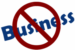
Did it take you a little bit to get the message from above image?
Once it registers, you will not forget the graphic. The same goes for everything that is unique and new to you with some kind of impact. If I added “Less is more” or anything in addition, it would take away from your own curiosity to find out what (if anything) it is trying to spell.
But since you have figured it out yourself, you will never forget how you felt when you saw it in its entirety.
With Pinterest, Instagram and all of the other social media outlets, there is plenty of need to show off all of your web design work one way or another.
Whatever you and your team are coming up with: Compile it into a file and revisit as needed. But as for your website itself: Moderate and limit to what you believe will work best and get people to join in.
8) Too much work for the visitors
One example: Having to refresh to see updates
A big part of what makes an online business successful is that once on the site, the site does all the work for you presenting you with the product.
When visitors come to a page that has expired content or requires a move on their part, a portion of the audience drops off. Make sure you keep the content refreshed if it requires being refreshed and present your clients with the latest of whatever keeps them interested. Especially if it is interactive and people connecting on a platform is what the product is all about.
9) Ignoring typography
This is one of the aspects where you can miss out on the chance to truly impact your visitors. When an experienced web designer used font family and size to make USP (Unique Selling Proposition) prominent, you are likely to reach the best results. Here is a great example of typography used effectively
You don´t need to create award-winning art.
But you need to use something that is guaranteed to increase your results based on previous studies
10) Incompatibility with browsers or mobile devices
This one is huge. Whether people come through Chrome, Firefox or still IE or any of the other browsers such as Opera:
The rule is:
Showing up is half the success
Not being available means not knowing whether or not your product will appeal. If someone has issues not being able to see all the content and not being able to experience all of the perks, then you might as well start over.
The same goes for mobile devices. Life is “on-the-go” and if you are not going with the flow, the stream will pass you by regardless how many fish you have to fry.


