You cannot deny the fact that some colors can lift you up, while some others can bring you down. Since colors are associated with different emotions and qualities, it is also possible to understand the psychology behind the colors of Call To Action (CTA) buttons to make your website convert more.
In different cultures, different colors have different meanings. Yellow represents sadness in Greece, but is sacred to the Hindus. The color of death in China is white, but purple is the color of death and mourning in Brazil. North Americans associate green with jealously and blue with trust.
Similarly, people from northern climates respond favourably to cooler colors, whereas people from tropical countries prefer the warmer colors. It means if you pick color of your CTA buttons considering your target market and geographic region, you may be able to build people’s trust in your brand more effectively.
Here are some other things that will help you select the best colors for call to action buttons and affect people psychologically to proceed and make an action:
- If your business has invested heavily in the look of your brand’s colors and design (like Ford, Coke, Starbucks, etc.) you will be better off selecting a color that compliments the colors on your website. You need to expand the color palette professionally to make your CTA buttons stand out without looking like a hack job.
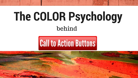
- Try red tactfully. Red grabs attention quickly but it can make you a winner or loser. Even when it grabs attention, it makes people do worse without their knowledge.
- Some companies have tried CTAs that are impossible to miss; in fact, they are borderline obnoxious. It has worked for some and you may want to go outside the box to test the same for your website.
- A less prominent color works well with users when you go for large buttons, whereas smaller buttons look more impressive in brighter colors. Choose the color of a button while paying attention to the color of surrounding elements and the background. An effective CTA button is always noticeable without interfering with the overall design of your website.
Many people believe that different colors on hover with call to action buttons help improve conversion. The fact is that it may affect conversion to some extent because of the psychological effect of colors as mentioned already, but you may not notice any dramatic boost.
Some experts believe orange and red hover buttons get more conversions, but that doesn’t hold true for every website, especially if your website design doesn’t suit orange or red button.
Keeping the button color in line with the rest of your website is more important and you need to pay more attention to contrast and ways to make that button stand out without looking weird.
In short, Call to action buttons are important because they tell your visitors what to do next. However, a CTA button is a combination of four things: shape, placement, the message, and color.
A professional web design company with knowledge about your industry, color psychology, and CTAs can help create winning graphics for you. Look for the best in the business!